Machine Learning Classification Model Evaluation Metrics
After training the machine learning classification model, we should always evaluate the model to determine if it does a good job of predicting the target value on new unseen data. Among the various metrics that could be used to evaluate the predictive power of a machine learning classification model, several most commonly used ones are: accuracy, precision, recall, F1 score, and AUC.
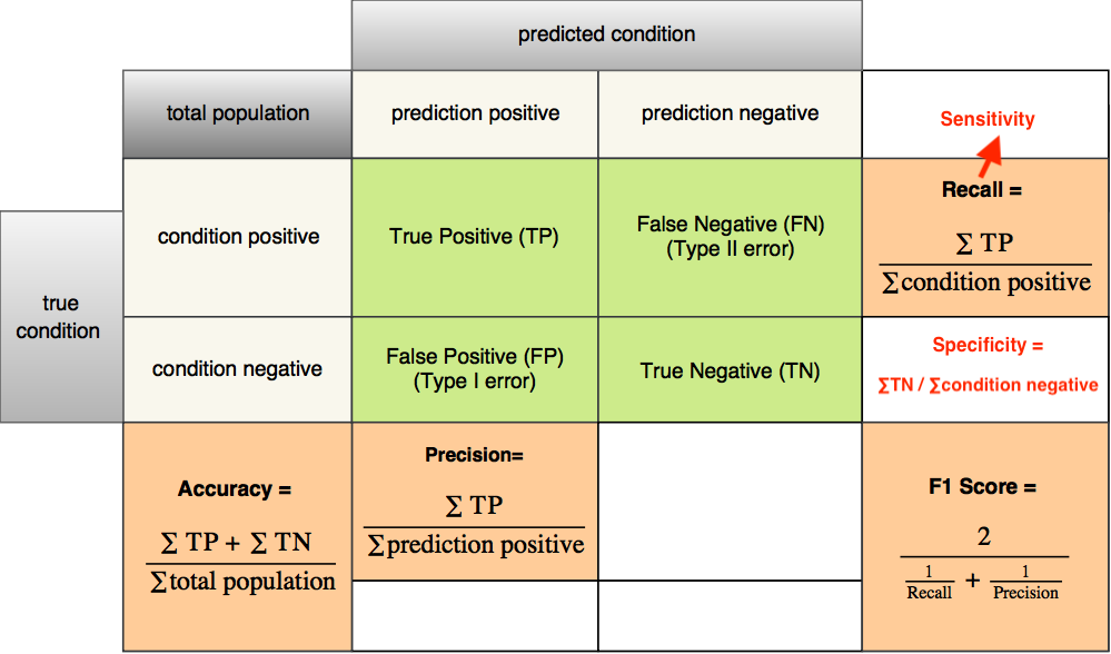
One common headache newcomers to machine learning have is to differentiate the nuances among the distinct evaluation metrics. I came across the same issue when I was in my first machine learning class. Back to that time, I searched extensively online and read a bunch of articles trying to figure out which one is which. And I found that the most efficient way to untangle this and fully understand the concepts is to use a contingency table, or called a confusion matrix.
Note: For the ease of demonstration and explanation, below I will talk in case of binary classification, in which the target variable only has two classes to be predicted.
Confusion matrix
Wikipedia provides an excellent confusion matrix illustrating all the formulas for all the metrics. While helpful, I found this confusion matrix kind of tedious since I won’t use all of the metrics and I only care about a few of them. So I decided to make a simplified version out of that confusion matrix, just showing the formulas for the four most commonly used metrics. Also, I’ll show you a real example on how to calculate them and how they differ in practice.
So, here you go. The following table shows the formulas for accuracy, precision, recall, and F1 score.
Type I and Type II error
As you can see from the table, all the formulas are based on the results for predictions that detect the presence of a condition. If a condition is positive, and the model also predicts it as positive, it’s then a true positive (TP) prediction. It’s a false negative (FN) prediction if the mode predicts it as negative. If the condition is negative, and the model predicts it as positive, the prediction is a false positive (FP). It’ll be a true negative (TN) if the model also predicts it as negative. FP is also called Type I error. And FN is called Type II error.
Take a look at the following image. If a doctor predicts a man is pregnant which in fact he is not (false positive), this is a Type I error. On the other hand, if a doctor predicts that a woman is not pregnant which in fact she is (false negative), this is a Type II error.

Accuracy, precision, recall, F1 score
Now, let’s get into the discussion of the first four model evaluation metrics. First, the definitions:
Accuracy: the ratio of correctly predicted observations to total observations.
Precision: the ratio of correctly predicted positive observations to the total predicted positive observations.
Recall: the ratio of correctly predicted positive observations to the total actual positive observations.
F1 score: the weighted average of precision and recall.
Don’t worry if you still feel lost reading these definitions. Let me give you a practical example to clarify their calculations. Assume your classification model is to predict whether or not an image contains a cat. Your testing set contains 100 images. And 40 images actually contain a cat, 60 images do not. The machine learning model identifies (predicts) 30 images as the ones which contain a cat, and other 70 as the ones do not. Of the 30 images identified as positive, 25 images actually contain a cat. Of the 70 images identified as negative, 15 images actually contain a cat.
So, TP = 25, FP = 5, FN = 15, TN = 55.
Then, we could get:
Accuracy = (25+55)/100 = 80/100 = 0.8
Precision = 25/30 = 0.83
Recall = 25/40 = 0.625
F1 score = 2x0.83x0.625/(0.83+0.625) = 0.71
ROC curve
Another commonly used evaluation metric for binary classification is called Area Under Curve (AUC). Normally the curve refers to the Receiver Operating Characteristic (ROC) curve. ROC curve plots the False Positive rate (1-specificity) versus the True Positive rate (sensitivity) for each possible threshold value used.
ROC is composed of sensitivity and specificity:
Sensitivity is actually recall. It is the ratio of correctly predicted positive observations to the total actual positive observations.
specificity is the ratio of correctly predicted negative observations to the total actual negative observations.
So how is ROC plotted exactly? Let’s look at an example.
Again, assume your classification model is to predict whether or not an image contains a cat. Your testing set contains 100 images. And 70 images actually contain a cat, 30 images do not.
If you select a cut-off point such that the model classifies 0 images as cat, 100 as not cat. Then we could get: sensitivity = 0/70 = 0, (1-specificity) = 1 - 30/30 = 0. The curve will pass the point (0, 0).
If you select another cut-off point such that the model classifies 40 images as cat, 60 as not cat. Of the 40 positive predicted images, 35 of them actually contain a cat. Of the 60 negative predicted images, 35 of them contain a cat. Then we could get: sensitivity = 35/70 = 0.50, (1-specificity) = 1 - 25/30 = 0.16. The curve will pass the point (0.16, 0.50).
If you select another cut-off point such that the model classifies 60 images as cat, 40 as not cat. Of the 60 positive predicted images, 50 of them actually contain a cat. Of the 40 negative predicted images, 20 of them contain a cat. Then we could get: sensitivity = 50/70 = 0.71, (1-specificity) = 1 - 20/30 = 0.33. The curve will pass the point (0.33, 0.71).
If you select another cut-off point such that the model classifies 80 images as cat, 20 as not cat. Of the 80 positive predicted images, 60 of them actually contain a cat. Of the 20 negative predicted images, 10 of them contain a cat. Then we could get: sensitivity = 60/70 = 0.86, (1-specificity) = 1 - 10/30 = 0.67. The curve will pass the point (0.67, 0.86).
If you select another cut-off point such that the model classifies all 100 images as cat, 0 as not cat. Then we could get: sensitivity = 70/70 = 1, (1-specificity) = 1 - 0/30 = 1. The curve will pass the point (1, 1).
These are just a few toy points you could possibly get. If you keep selecting different cut-off points and you’ll end up with different sensitivity and specificity values and hence different points on the ROC curve.
For a perfect model that correctly classifies every instance, the ROC curve will pass through the upper left corner. The closer the curve comes to the upper left corner, the better the classification performance. The closer the curve comes to the 45-degree diagonal, the worse the classification performance.
The area under the curve (AUC) is an evaluation metric that can be obtained from the ROC curve. If the classifier is perfect at predicting, the AUC will be close to 1. If the classifier is no better than random guessing, the AUC will be around 0.5.
Conclusion
As for which one/ones you should use and what constitutes good metrics, it really depends on the specific problem you are dealing with. When the distribution of the classes in data is well balanced, accuracy can give you a good picture of how the model is performing. But when you have skewed data, for example, one of the class is dominant in your data set, then accuracy might not be enough to evaluate your model. Let’s say you have a dataset which contains 80% positive class, and 20% negative class. This means that by predicting every data into the positive class, the model will get 80% accuracy. In this case, you might want to explore further into the confusion matrix and try different evaluation metrics.